Axunio packaging system
Making the niche visible
The young pharmaceutical company axunio takes a holistic view of the human body and also sells medicines for therapeutic niches. The new packaging design creates a consistent brand world with an elementary design language.
axunio Pharma GmbH has been distributing generic pharmaceuticals in Germany, the UK, Scandinavia, and the Netherlands since 2016. The products are developed in the company’s research and development laboratories and in collaboration with external partners.
logo credits: axunio
The design of the x in the name axunio already refers to the core concern of the brand – approaching health holistically. At the same time, the –unio in the name addresses a rethink towards a fairer society. With its mission to uncover previously overlooked needs and to include minorities and their unique requirements, the company takes an independent path: “Every person, even those with special needs that have not yet received enough attention, is worthy of receiving access to therapy as quickly and easily as possible.”
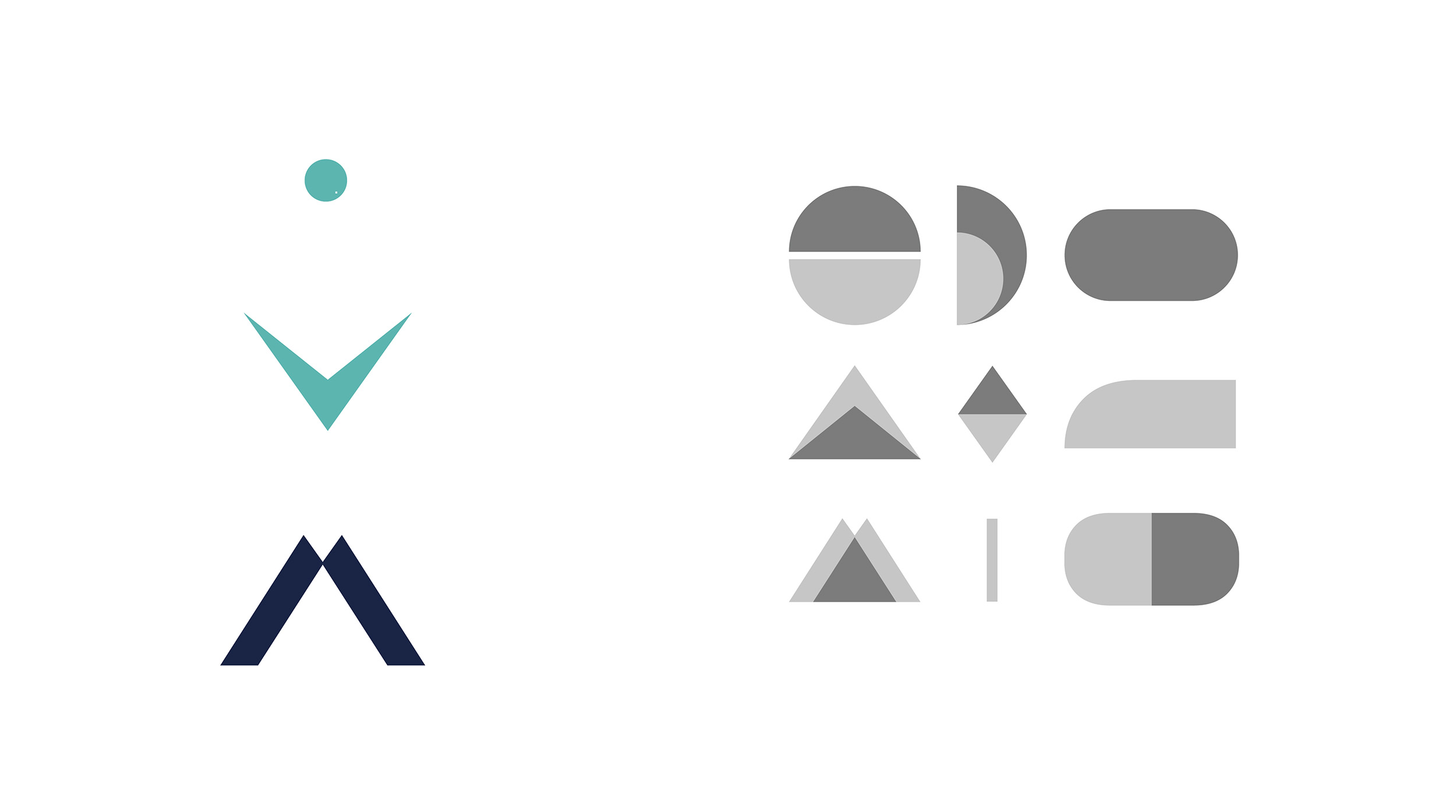
Elementary shape-language
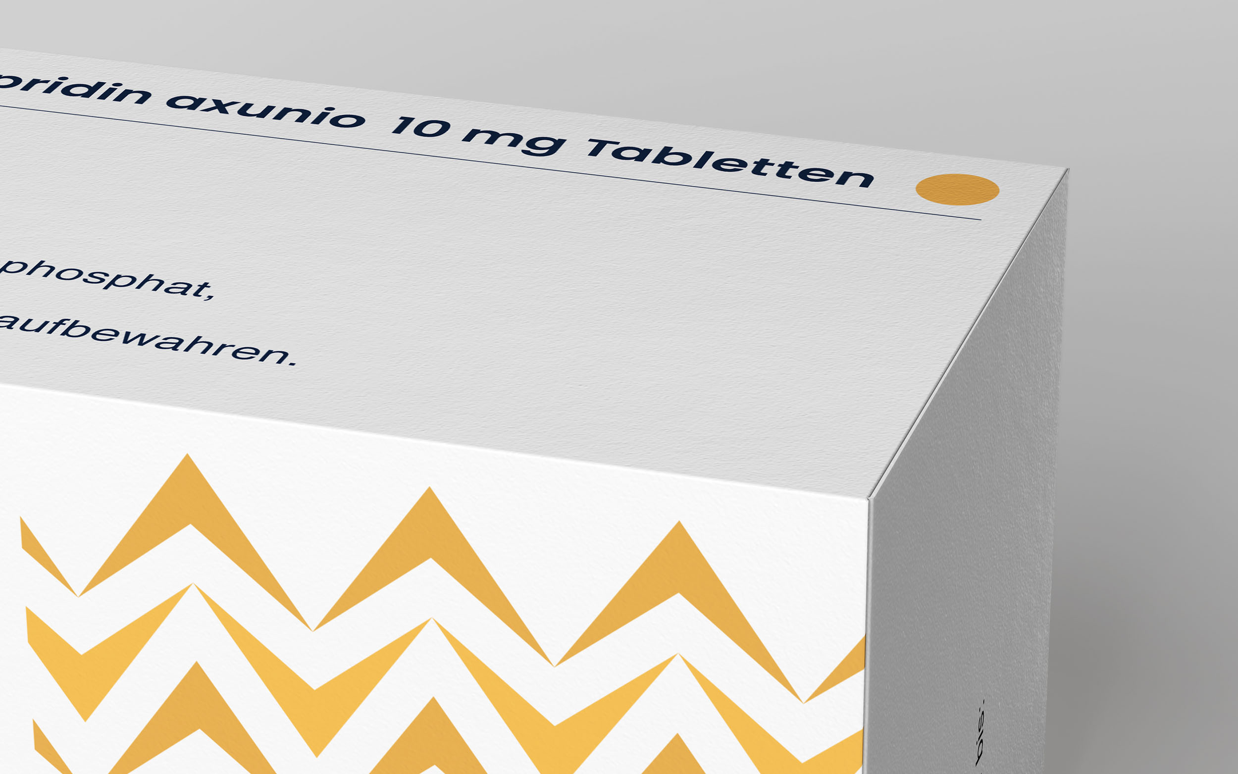
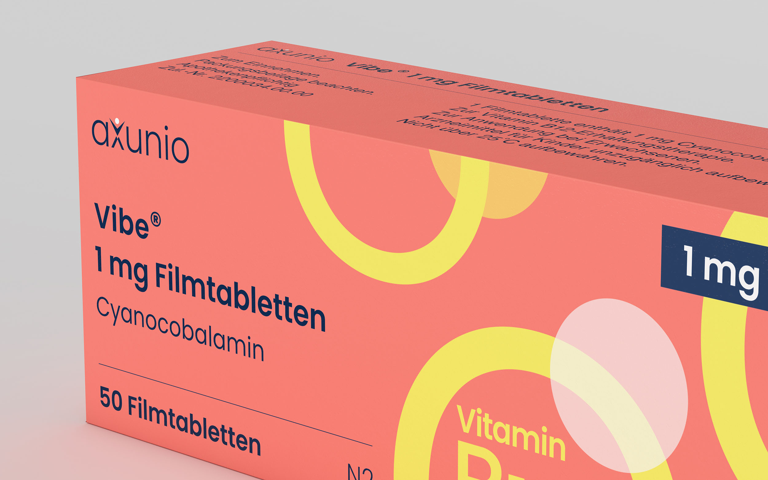
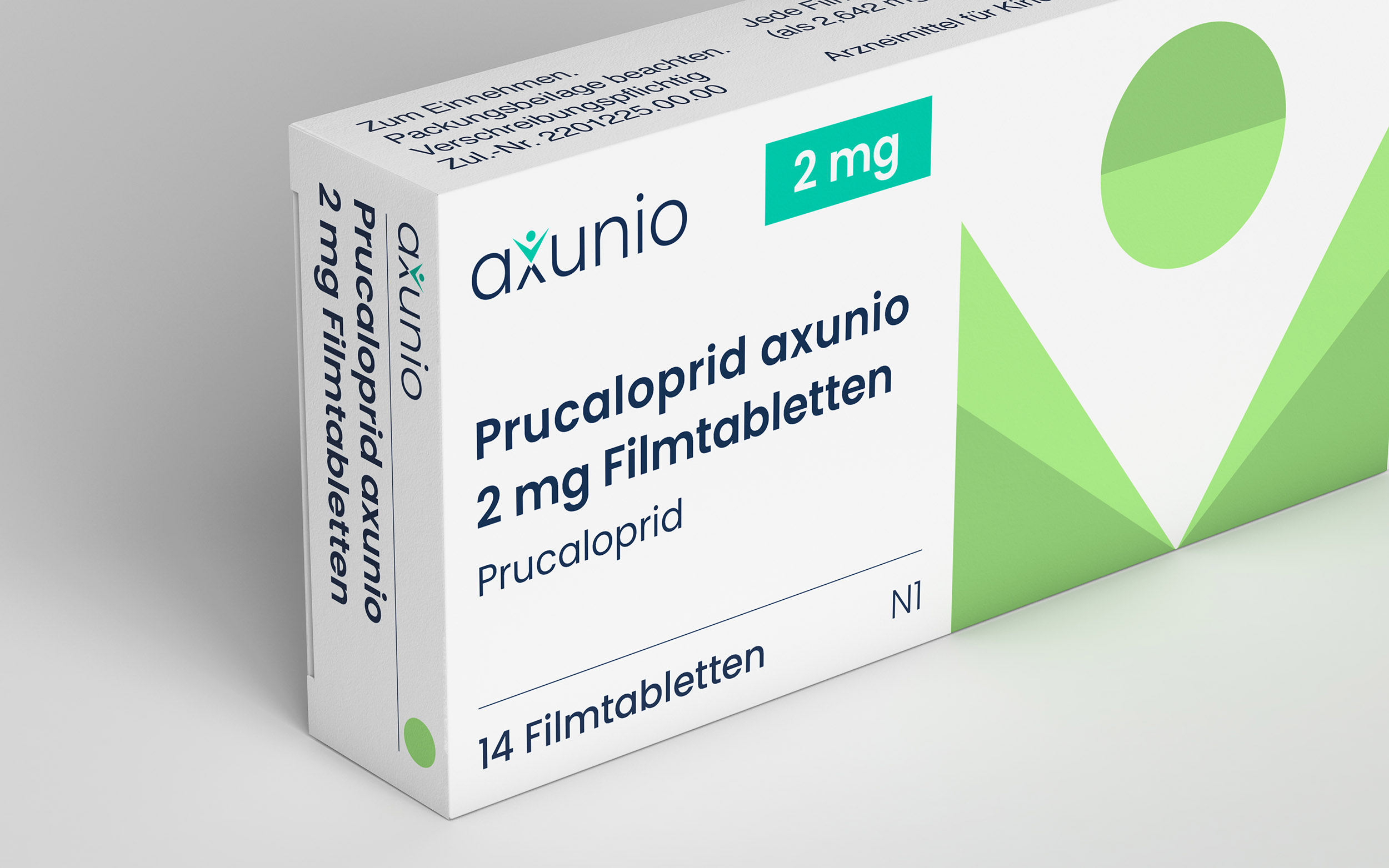
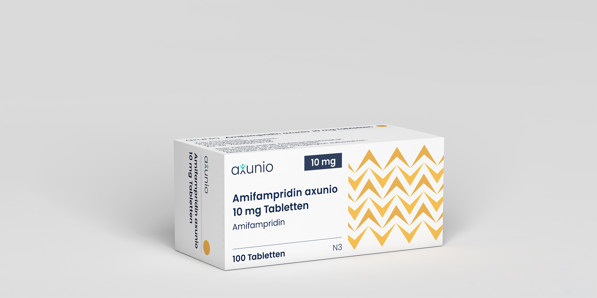
We developed a new packaging system based on the logo and, therefore, in line with the company’s holistic approach – creating an evolutionary link to the existing brand. Design elements derive from the shapes and hallmarks of the lettering and the body, which dynamically come together on each product to form unique arrangements. The resulting patterns create a reliable orientation for the user.

Only three printing colours were used for the packaging design. Each color was assigned to one of the ATC groups to ensure that the products were easily distinguishable. The ACT groups are based on the organ or body system on which the medicines have an effect. By overprinting these colours with the two axunio brand colours, a wide range of different shades can be reproduced.
Combined with the patterns, this technique creates a clear, versatile, and sustainable framework. The system of colours is used to highlight the dosage quantities.
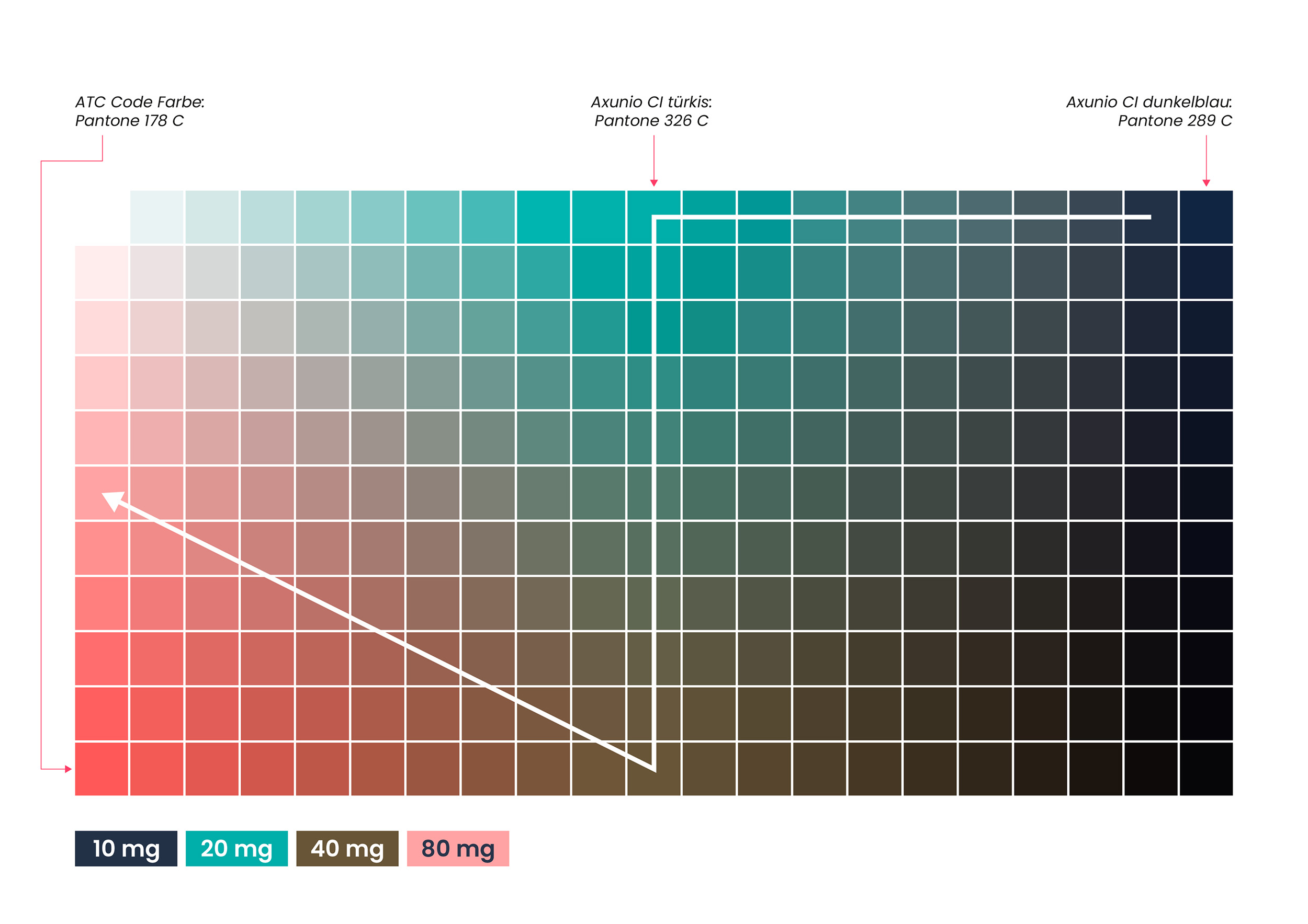
The three-colour system creates maximum variance with minimum complexity. Three colours create a wide range of extensions or differentiation options.
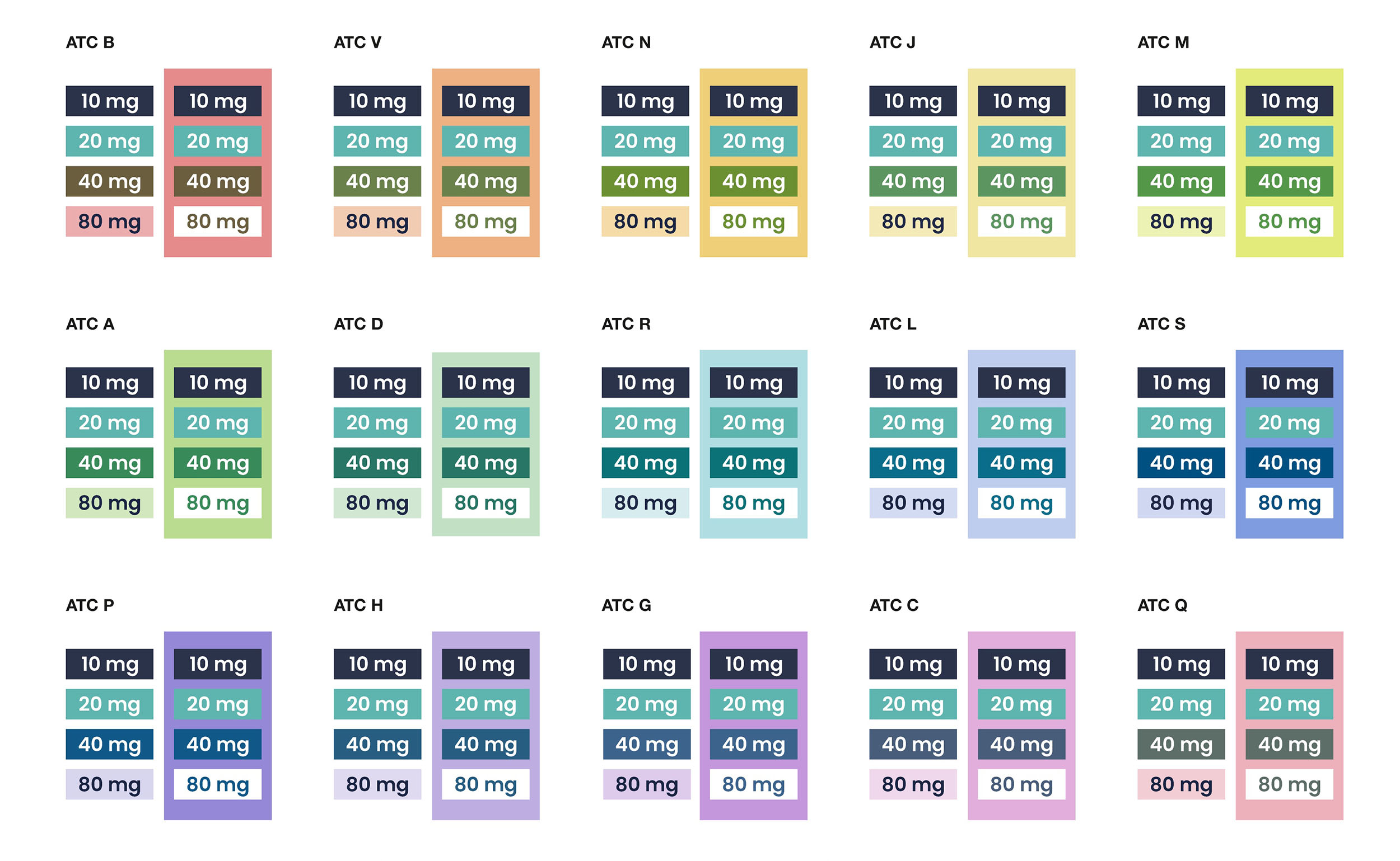
The result is an elementary design language with vital “effect patterns” for axunio’s independent, consistent brand world – from the individual product appearance to the holistic product range design. Together with the development of the system, the start-up’s first three products were also designed to show the system in action.
