New image for FRANK
Life at the center
The new image of the FRANK brand embodies the real estate company’s claim: spaces should grow beyond themselves so that we can unfold our lives in them.
For FRANK, rooms are the opposite of restrictive. They should open up, give air to breathe and provide interesting views. They should connect, promote good neighborliness, become meeting places for community and play, as well as provide retreat and silence. They should feature favorite places, plants for greenery and create access to new mobility and local amenities. And they should fulfill the desire for a healthy and sustainable environment.
The image of space as a constantly changing life format increasingly emerged in our brand workshop with FRANK. A format that changes depending on the needs and stages of life: for families with space usage that often varies daily, singles with a flexible and mobile living culture, couples with active redesign ambitions, or intergenerational partnerships with space-sharing ideas.

For FRANK, thinking of spaces as dynamic living formats is the key to people. It is synonymous with a deep understanding of their different ideas about life, the design of innovative living spaces, and the use of the latest technologies. It is the key to new spaces that enrich our lives – and spaces that we enrich with our lives. For the company and the brand, it is the combination of tradition and future: FRANK. Future living formats since 1925.
An A, in which life can unfold
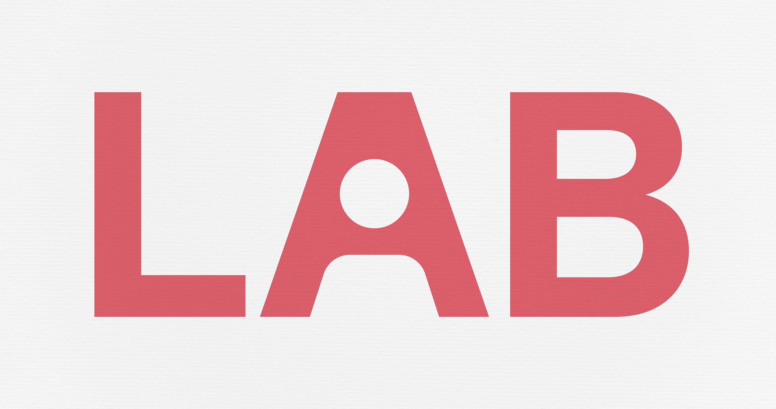
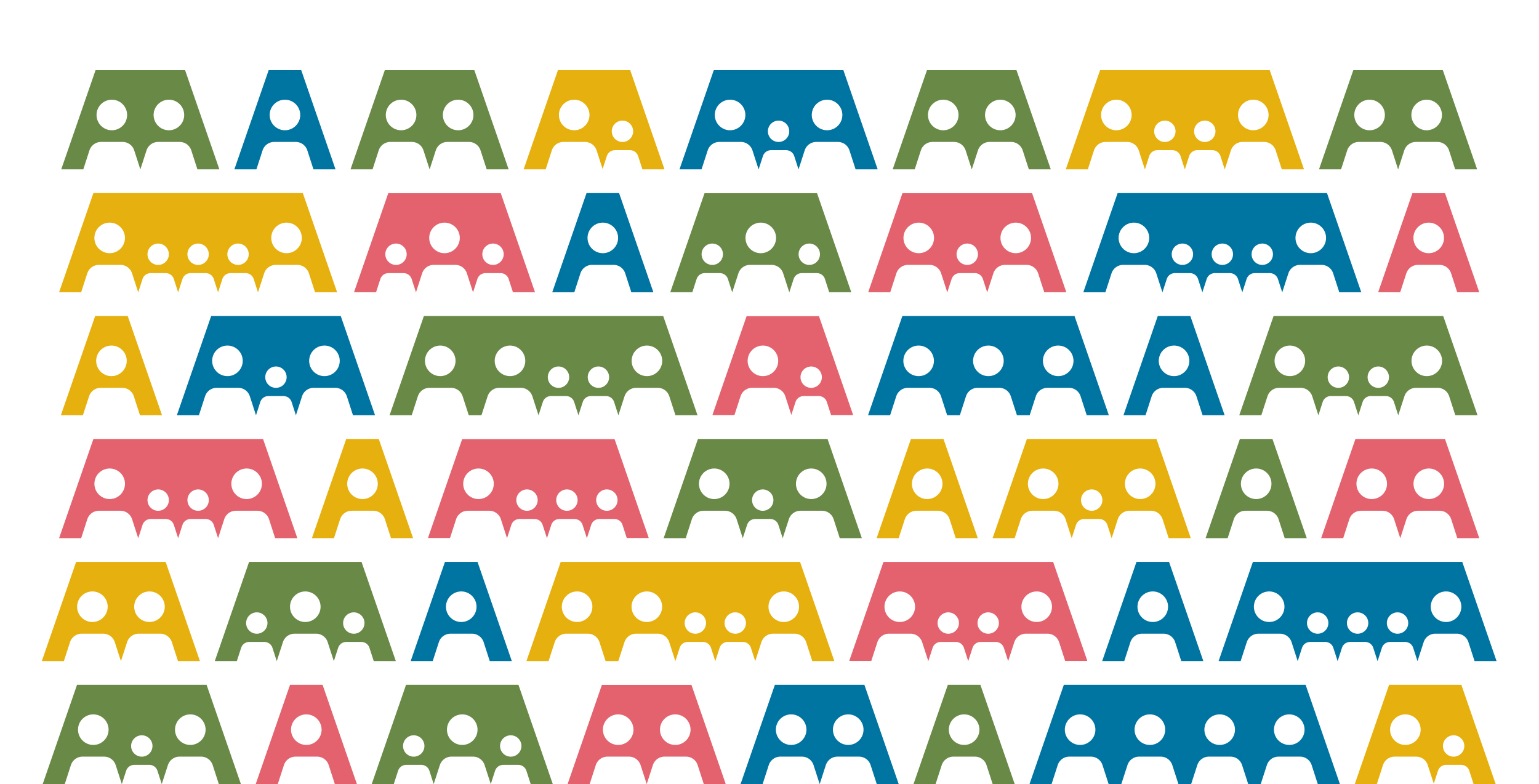
For the new corporate design, we have translated the ideal of flexible, changeable life formats into a design pattern. The starting point is the new FRANK logo, which literally places people at the center through the visual integration of the head and shoulder in the letter A. The principle develops based on this design move: life unfolds in the space in the A. It appears open, adaptable and grows and shrinks according to the needs of life – life at the center.


